Typeface Design
Überschrift
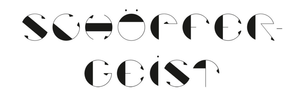
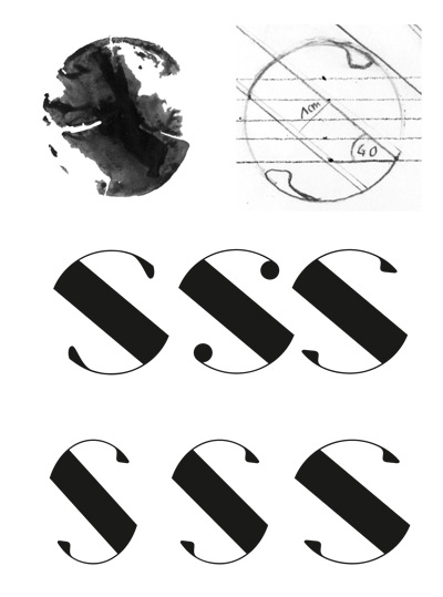
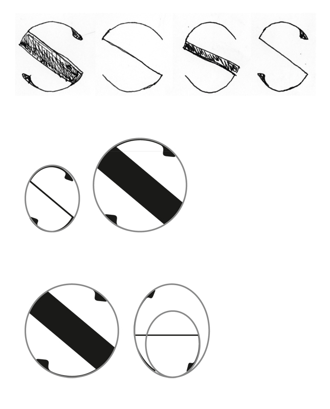
Die Grundform der Schrift ist ein Abdruck eines Astes.Die Figur habe ich in geometrische Formen vereinfacht. Ihre Eigenschaften wie Winkel und Strichstärken habe ich auf alle
Buchstaben übertragen. Details wie Serifen wurden getestet und festgelegt.
Ebenfalls habe ich verschiedene Formen ausprobiert. Am Ende bin ich beim Kreis geblieben,
da sich die Form nicht zu sehr vom Ursprung entfernt und er trotzdem gut lesbar ist.
Headline
The basic shape of the font is an impression of a branch, which I simplified into geometric shapes. I have adapted their properties such as angles and line widths to all possible
Transferring letters. Details such as serifs have been tested and defined.
I have also tried different shapes. In the end, I stayed with the circle,
as the form does not deviate too much from its origin and is still easy to read.
Textschrift
Alle Eigenschaften der Headline habe ich einzeln weggelassen. Die entstandenen Variationen wurden auf ihre Lesbarkeit und Kombination überprüft. Es kam heraus, dass die Ovalschrift mit den Serifen besser lesbar ist und am wenigsten aufdringlich gegenüber der Headline wirkt. Sie besteht aus Minuskeln, die zwei Drittel so groß sind wie die Versalien. Die Unter- und Oberlängen der Minuskeln sind aus der Höhe der Headline abgeleitet.
Textfont
I have omitted all characteristics of the headline individually. The resulting variations were checked for legibility and combination. It turned out that the oval font is easier to read with the serifs and is least obtrusive to the headline. It consists of minuscules which are two-thirds the size of the capitals. The lower and upper lengths of the muscles are derived from the height of the headline.
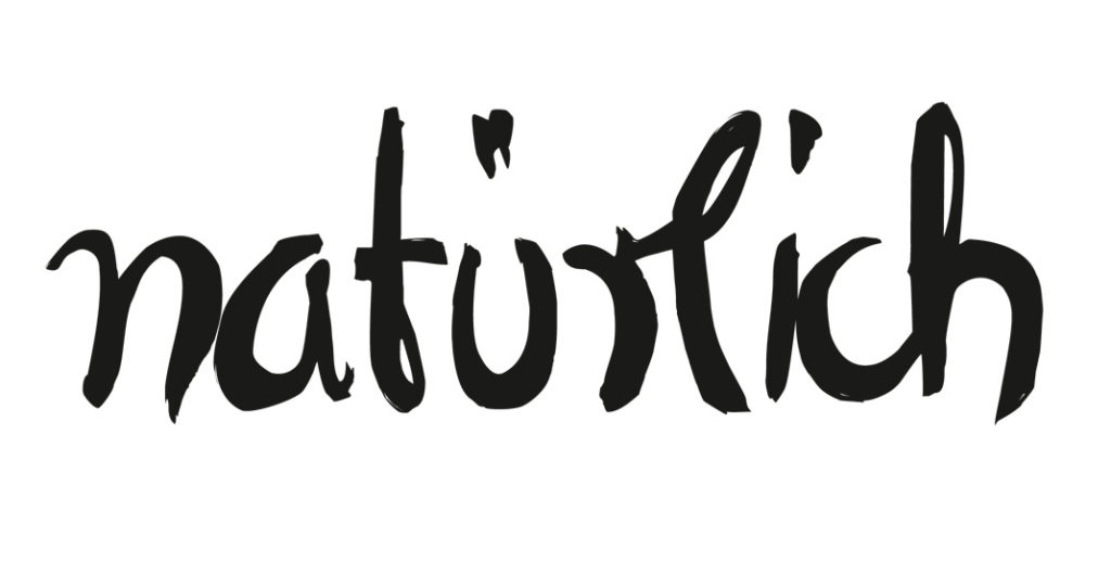
Das Magazin „Natürlich“ für Heilkunde und Beauty hatte eine minimalistische, serifenlose Schrift. Sie wirkte eher spitz und weniger natürlich. Die Schrift solle natürlicher wirken aber auch Mode und Beauty tauglich sein. Mit Pinsel und Acryl habe ich die Headline neu gezeichnet, somit habe ich durch die Struktur und das handgezeichnete eine natürliche
Wirkung erzeugt. Die geschwungene Schreibschrift passt auch gut zu Beauty.
The magazine „Natürlich“ for health and beauty had a minimalist, sans serif typeface. It seemed more sharp and less natural. The typeface should appear more natural, but also be suitable for fashion and beauty. With brush and acrylic I have redrawn the headline, so I have created a natural effect through the structure and the hand drawn. The curved curvilinear handwriting is also a good match for Beauty.